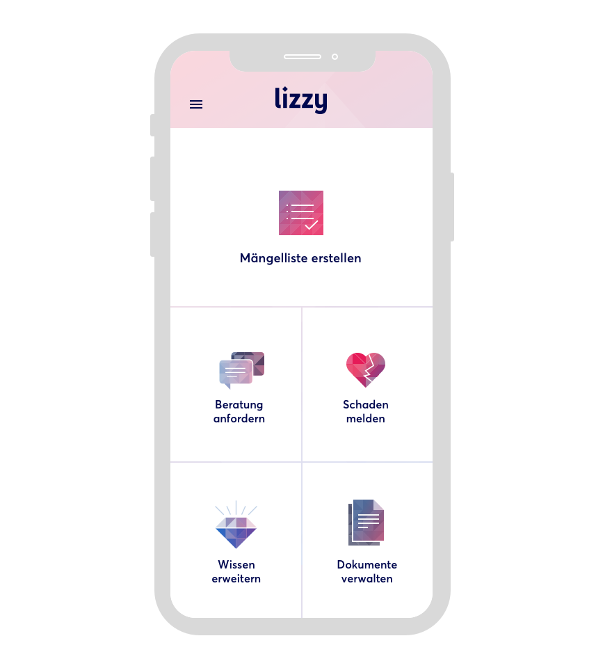
Lizzy makes reporting damages in a newly rented property easier than ever. With Mobiliar, we transformed a tedious, time-consuming task into a relaxed experience. The app is the first of its kind in Switzerland and is unique in its visual composition. Lizzy is both bold and dynamic, while actively supporting the user.
We redefined the vision for Migros-Magazin. With more than three million readers in Switzerland, a significant part of their content is user-generated. The new design intends to move away from the one sided editorial content of traditional magazines.
We helped Helsana to rethink the way they sell health insurance online. We designed a user-centered business model that led to an increase in sales of more than 30% and ultimately revolutionized the industry standard in Switzerland.
The most widely used mobile application in Switzerland is now faster, easier and more beautiful than ever. Our designers helped SBB to reduce the steps necessary for customers to purchase their transportation tickets.
Since it was launched, Doodle’s free app has been a worldwide success. Our continued design collaboration has helped Doodle maintain the brand's character as their product has become available across various platforms, mobile and desktop.
When we joined the TWINT product team, our primary goal was to improve the usability and alleviate the issues that current users were reporting with the app. We recreated the TWINT experience by removing existing barriers, providing more value and forming new habits for TWINT users.
By using complex geolocation technology, the Uepaa app connects users to each other and helps them contact nearby fellow hikers in emergency alpine situations. We were able to create an interface so simple and intuitive, you can use it even under the most extreme circumstances.
We helped Swisscom, Switzerland’s leading communication service, to build their first cloud service: A digital safe for your most personal data that is as easy to use as email.
We placed local and relevant business entries on the landing page. This allowed us to reduce the four existing search fields down to just a single user-friendly one.